Table
When to use
- The user needs to compare multiple records across a consistent set of attributes.
- The data has a clear row-and-column structure that helps users scan, find, and act on information.
- The dataset is large enough to benefit from sorting, pagination, or sticky headers to preserve context.
When not to use
Usage guidance
How to structure, align, decorate, and extend tables so users can scan, compare, and act on data.
Header positioning
Most tables have headers at the top row. In some cases it makes sense to place headers in the first column instead, or to use both when the data has two dimensions, such as a timetable with weekdays across and timeslots down.

Column order and alignment
Prioritise columns by importance, typically from left to right. On narrow screens the rightmost columns will be the first hidden from view.
Closely related columns of unequal importance can stay together when the two columns are only meaningful read together and separating them would force users to cross-reference.
Apply these alignment rules for easier scanning:
- Left-align text, including non-countable numerals such as dates and phone numbers.
- Right-align numbers, and consider monospaced numbers.
- Align each heading the same way as the data in its column.
Center alignment can be appropriate when the cell content is made of equal-width icons.

Vertical alignment
Middle-align cell content when row heights vary by no more than two to three lines. Switch to top alignment when rows vary more, because middle alignment makes longer cells harder to scan. Avoid bottom alignment in most cases. It risks hiding content near the viewport edge, especially with multi-line cells of varying length.


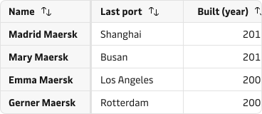
Handling overflow
When the table overflows horizontally, keep headers or the first column sticky so users do not lose track of what the data represents.

Patterns
Common compositions that extend a table to handle structure, overflow, and large datasets.
Header groups
Use header groups to reduce duplicated labels and make the overall table structure easier to scan.

Header tooltips
Use header tooltips when a column label might be misunderstood or uses acronyms that need clarification (e.g. INCO terms).

Footer summaries
Use a footer when numerical data needs summarising. Make the footer visually distinct from the body so users can tell it represents a summary, not another record.

Combining columns
Combine two columns into one cell only when they describe the same entity (for example port and country) and users read them together rather than comparing them independently. Keep them in separate columns when users need to sort or scan either value on its own.


Combining saves horizontal space but removes the ability to sort or scan either value on its own, so weigh it against how users work with the data.
Colspan and rowspan
Use colspan when a label or description needs to span multiple columns, and rowspan when a label applies to multiple rows. Prefer header groups when the only goal is to group columns under one category.


Row decoration
Keep table decoration minimal. Use alignment and hierarchy first, then add only the separators needed for comprehension.
Horizontal row separators are the default and should be applied in most tables since they guide the eye along each row.

Vertical lines separate columns and help compare values across rows, but they are rarely needed when columns are well aligned. They are more common in large or advanced data grids.

Row highlight on hover lets users focus on one row at a time without adding permanent clutter. It has no benefit on touch devices.

Zebra stripes (alternating row background colours) can improve scannability for tables with many columns that scroll horizontally, but they add visual clutter and may cause contrast issues. Consider horizontal lines or hover highlighting first.

Expandable rows
Use expandable rows for simple, structured supplementary information while keeping the parent row visible for context.


Use headings, bullet points, or small tables to keep expanded content structured. Limit expansion to one level. Further nesting overwhelms rather than informs. If the supplementary information is large or interactive, move it to a modal or side panel instead. Avoid expanding several rows at once when the expanded content would push the remaining rows out of view.
Sorting and filtering
Allow sorting through clickable headers and show the active sorting mode clearly with a visible icon or direction cue. The expected sort cycle is:
- Default / unsorted (↑↓)
- Ascending order (↑ 0–9, a–z)
- Descending order (↓ 9–0, z–a)

Filtering works alongside sorting to help users narrow large datasets before comparing rows. For guidance on filter placement, behaviour, and interaction with sorting and pagination, see the search, filter, and sort guidelines.
Pagination
Split large row sets across pages when a single view no longer supports overview or comparison.

Toolbar
The table supports two toolbar types: a default toolbar for table-wide actions and a bulk action toolbar for actions on selected rows. Only one toolbar is visible at a time. The bulk action toolbar takes priority when one or more rows are selected.
Default toolbar
Use the default toolbar when actions apply to the entire table or dataset, are frequently accessed but not destructive, and do not depend on row selection.

Bulk action toolbar
Use the bulk action toolbar when actions require row selection and the same action can be applied to multiple items.

Content guidance
- Use a less-is-more approach to selecting and structuring the data so the table supports decision-making without overload.
- Keep header labels as short as possible to increase clarity and avoid truncation or wrapping.
- Declutter repetitive data by using conventional icons, abbreviations, and shared units in headers instead of repeating them in every cell.
- Use a dash when a cell contains no data so users know the content was loaded and is intentionally absent.
- Let long cell content wrap by default. Only truncate when hiding the full value will not block understanding and users can access the complete text through an alternative such as a tooltip. Read more in the truncation guidelines.


States and feedback
Keep table headers visible when the table changes state so users still understand what data the view is meant to contain.
- Empty state: use when the table has not been populated yet.
- Loading state: show a loading state when data takes more than about one second to arrive. The more accurate the progress information, the better.
- No results state: explain the reason and show a path back to relevant data.
- Error and warning state: make failure visible and keep the user oriented in the table context.


Accessibility
- Include a header so assistive technologies and sighted users can understand what each column or row contains.
- Use a simple table structure wherever possible.
- Provide a caption or equivalent description so the table purpose is clear.
- Avoid empty cells. Use a dash to indicate intentionally absent values (see Content guidance above).
- Do not use tables for layout purposes.
- When many interactive elements make keyboard or screen-reader navigation repetitive, use a data grid as described in When not to use above.
The component already renders semantic header cells, exposes sort state, applies sticky positioning, and associates the caption with the table. Read more in the accessibility guidelines.
Related components
| Component | Use case |
|---|---|
| Pagination | When a table has too many rows for a single page and overview needs to be restored |
| Tooltip | When a column header needs a short clarification that would not fit in the label |
| Notification | When loading fails or a warning condition needs to be communicated clearly |
| Modal | When inline row expansion would overload the table and a focused disclosure is needed |